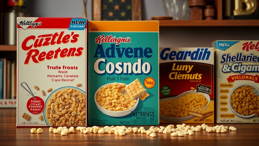
Identifying Authentic Vintage Cereal Box Variations

Most collectors assume that a vintage cereal box is a static object, but that’s a mistake. A box produced in 1964 isn't just one version; it's often a collection of subtle, high-value variations involving print runs, ingredient changes, and even packaging dimensions. If you don't know what you're looking for, you might pass over a rare "error" or a limited-run promotional box thinking it's just a standard, low-value piece. This guide breaks down the technical markers of authenticity and the specific variations that separate a common shelf-filler from a museum-grade specimen.
What defines a vintage cereal box variation?
A variation occurs when a manufacturer changes a specific element of the packaging—like the font, the color palette, or the legal text—without changing the core product. These aren't mistakes. They are often intentional shifts in branding or regulatory requirements. For example, a change in the FDA nutrition facts label format can instantly date a box by a specific year, even if the cereal inside remains the same.
To spot these, you have to look past the bright colors and focus on the fine print. Sometimes, a small change in the weight declaration (switching from ounces to grams) indicates a specific era of production. These tiny details are what collectors obsess over. It's the difference between a common 1980s box of Kellogg's Frosted Flakes and a much rarer early-run version with a different logo placement.
When you're hunting for these, keep an eye out for:
- Color shifts: Slight variations in ink saturation or "bleed" between print runs.
- Typography: Changes in font weight or the addition of a new trademark symbol.
- Legal Disclaimers: Changes in manufacturer address or updated nutritional requirements.
- Promotional Inserts: Differences in the "prize inside" text or the presence of a specific toy era.
I've spent years looking at these through a magnifying glass, and I can tell you—the nuance is everything. One tiny line of text can change a box's value from five dollars to fifty.
How can I tell if a box is an authentic vintage piece?
Authentic vintage boxes are identified by the specific printing technologies and paper stocks available during their production era. Modern high-quality reproductions often fail to replicate the way vintage ink interacts with older, more porous paper. If the colors look too "perfect" or the digital printing looks crisp and flat, you might be looking at a modern reproduction rather than a genuine relic from the 1970s.
Check the way the ink sits on the cardboard. Older printing methods, such as lithography, often have a specific texture or a slight "halo" effect around the edges of the graphics. If the box looks like it was printed on a modern inkjet printer, proceed with caution. You can research historical printing methods through resources like Wikipedia's documentation on lithography to see how the process has evolved.
Another red flag is the weight. Modern cardboard is often thinner and more uniform. Vintage boxes usually have a heavier, more substantial feel to the paperboard. If you're ever unsure about the era of a specific brand, you can often cross-reference the manufacturer's history on official SEC filings or corporate archives to see when certain packaging updates were officially announced.
Don't forget to check the "scent." I know that sounds weird, but old cardboard has a distinct, musty aroma that is very hard to fake. A brand-new "vintage" box that smells like fresh chemicals is a bad sign. It's a small detail, but it matters when you're trying to verify a high-value find.
The Comparison of Era-Specific Markers
| Era | Common Marker | Typical Paper Quality | Common Variation |
|---|---|---|---|
| 1950s-1960s | Hand-drawn illustrations | Thick, porous board | Early trademark placements |
| 1970s-1980s | Bold, graphic fonts | Medium weight, smoother | Nutrition label transitions |
| 1990s-Present | Digital/PhotographicThin, high-gloss | Frequent legal updates |
It’s also helpful to look at the differences in error boxes versus intentional variations. A mistake is an accident; a variation is a documented change in the production line. Knowing the difference helps you avoid overpaying for something that was never meant to be rare.
How do I identify high-value misprints?
High-value misprints are accidental deviations from the standard print run, such as an inverted color plate or a misspelled brand name. While variations are a part of the standard production cycle, misprints are genuine errors. These are much harder to find because they are, by definition, mistakes that the factory tried to catch and discard.
Look for things like "offset printing" where one color is shifted slightly to the left or right, creating a ghosting effect. This can make a box look incredibly striking, but it's technically a defect. In the world of paper and print collecting, these "defects" are the holy grails. If you find a box where the logo is entirely the wrong color—say, a blue box with red text—you've hit the jackpot.
However, don't go buying every "weird" box you see. Many "misprints" are just low-quality versions of the original. A true high-value misprint usually involves a significant error that is clearly visible to the naked eye. If the error is microscopic, it likely won't add much to the value. It's a fine line between a collector's item and a piece of trash.
To protect these delicate items, I highly recommend using acid-free sleeves. A misprinted box is even more vulnerable to environmental damage because the print quality is already compromised. If the ink is already behaving badly, you don't want humidity or light making it worse.
When you're out in the field, whether at a garage sale or a specialized auction, keep your eyes peeled for these inconsistencies. Most people see a box and see cereal. You see a box and see a timeline of industrial history. That perspective is what separates the casual hobbyist from the serious collector.
Always verify the era before you assume a box is a rare variation. If you see a box that looks "off," it might just be a poorly preserved standard edition. A worn-down corner doesn't make a box a rare variation—it just makes it a worn-down box. Be diligent, keep your eyes sharp, and always check the fine print.