Identifying Rare Printing Errors in Vintage Paper Packaging

A collector holds a 1960s cereal box up to the light, noticing the registration is slightly off. The blue ink of the mascot's hat bleeds into the white space, or perhaps a single color layer is missing entirely from the side panel. What looks like a mistake to a casual observer is actually a high-value anomaly to a serious enthusiast. These printing errors—ranging from subtle color shifts to significant mechanical failures—define the rarity of certain pieces in the world of paper and print collectibles. Understanding these discrepancies isn't just about spotting a mistake; it's about identifying the technical lapses that occurred during the high-speed production runs of the mid-20th century.
Why do printing errors increase value?
In the world of mass production, perfection is the goal. When a machine fails, it creates a deviation from the standard. For a collector of cereal boxes or vintage paper ephemera, these deviations are where the value lives. A "misprint" is a moment where the intended design failed to manifest, creating a one-of-a-kind version of a common object. These errors might be caused by a poorly calibrated color press, a slip in the paper feed, or even an incorrect plate being used during a shift change. Because these items were never intended to reach the consumer, their survival in the wild is statistically much lower than the standard version, driving up their desirability at auction.
There are several types of errors to look for:
- Color Registration Errors: This happens when the different color plates do not line up perfectly, resulting in a blurry or "ghosted" image.
- Missing Color Layers: A specific color might be completely absent, such as a box where the red ink failed to transfer entirely.
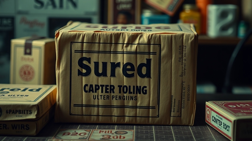
- Typographical Errors: A misspelled brand name or an incorrect date on the nutritional information.
- Inverted Imagery: When a design element is printed upside down or backward relative to the rest of the box.
While a heavy smudge might just look like a damaged box, a clean, systematic error—like a missing ink layer—is a much more significant find. If you find a box where the entire left panel is a different color than the right, you've likely found a genuine printing anomaly rather than simple shelf wear.
How can I tell if a mistake is a genuine error or just damage?
This is the hardest part of the hobby. A collector must distinguish between a printing error (which happened at the factory) and environmental damage (which happened after the box left the factory). Damage is usually the result of handling, moisture, or age. An error, however, is a structural part of the printed design itself.
To determine this, look at the edges of the error. If the "mistake" follows the contours of the printed graphics perfectly, it is likely a printing error. If the discoloration or ink loss follows a tear, a crease, or a water stain, it is damage. For instance, if a color is missing in a perfect rectangle that matches the shape of the printing plate, that's a production error. If the color is missing in a jagged shape that looks like a scratch, it's just a worn-out box. You can often use a jeweler's loupe to examine the ink density under magnification. A true printing error will show a clean absence of ink, whereas a scratch or scuff will show physical disruption to the paper fibers.
Check the Library of Congress guidelines on paper preservation if you want to understand how paper reacts to different types of physical stress. This will help you realize that a stain from humidity is not the same as a color registration error from a 1954 offset press.
What are the most common types of misprints?
If you are scanning through a recent batch of finds, keep an eye out for these three common categories of misprints. They are often the most sought-after in the paper ephemera community.
- The Offset Error: This occurs when the printing plate is slightly shifted. It creates a sense of depth or a "double image" effect. While it can look messy, it is a hallmark of older, high-speed mechanical printing.
- The Ink Starvation: This happens when the ink reservoir runs low or the pressure is uneven. You might see a box that looks "faded" on one side, but upon closer inspection, the ink is simply not being applied heavily enough in that section.
- The Wrong Plate Error: This is the "holy grail" for many. This occurs when a different design or a different brand's plate is used on a box. For example, seeing a different mascot's eyes on a cereal box can be a sign of a massive mechanical mix-up at the plant.
A great resource for learning more about the history of printing techniques is the Museum of Printing. Understanding the mechanics of how ink meets paper will make you a much better judge of what is a genuine error and what is simply a poorly kept item.
A Checklist for the Collector
When you are looking at a potential new addition to your collection, use this quick mental checklist to evaluate the quality of the paper and the integrity of the print:
| Feature | What to Look For | Potential Result |
|---|---|---|
| Ink Density | Consistent saturation across the design. | High value if a specific color is missing. |
| Alignment | Perfectly centered graphics and text. | Misalignment indicates a registration error. |
| Paper Texture | Smoothness of the coating/finish. | Rough patches often indicate damage/moisture. |
| Edge Sharpness | Crispness of the printed lines. | Blurry lines suggest an offset error. |
Always remember that a "perfect" box is a standard specimen. A "flawed" box can be a masterpiece of accidental history. If you see a box that looks slightly "off," don't toss it. Examine it closely. The very thing that makes it look imperfect to the general public is exactly what makes it a treasure for the specialist. The difference between a piece of trash and a centerpiece is often just a few millimeters of ink placement.