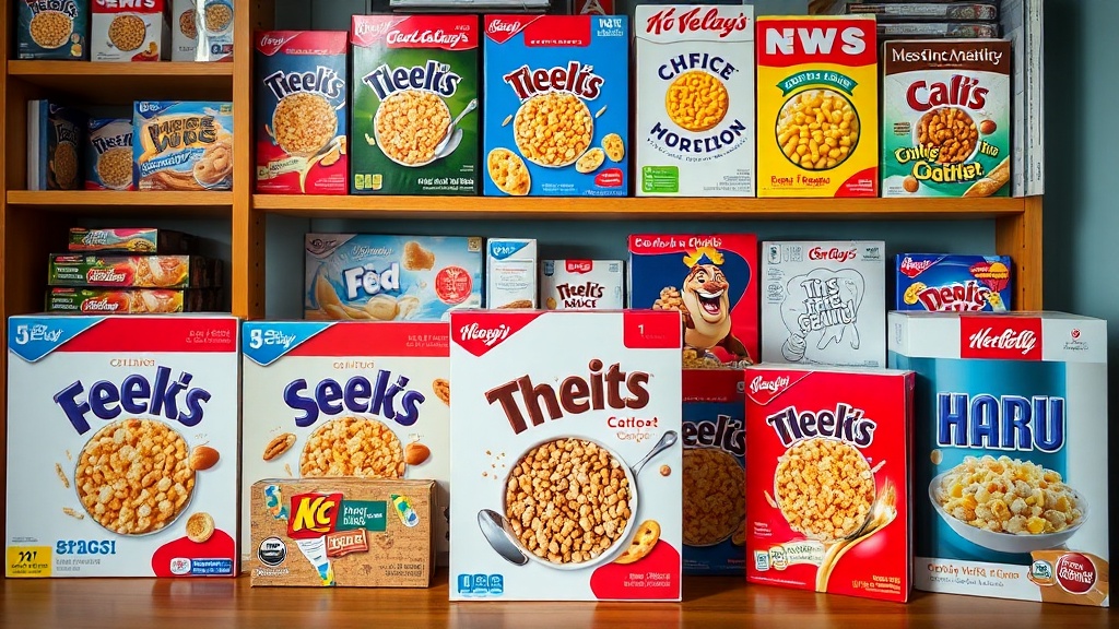
Arranging Your Cereal Box Gallery for Maximum Impact

You’ve finally finished that hunt for a complete 1960s Trix set, and now you’re staring at a stack of cardboard boxes that look more like a cluttered pantry than a curated collection. Displaying cereal boxes is a different beast than displaying coins or stamps because of their sheer volume and three-dimensional footprint. This post covers how to organize, mount, and display your cereal box collection to turn a pile of paper into a professional-looking gallery.
The goal is to move beyond the "box in a bin" stage and move toward a visual presentation that highlights the graphic design and typography of your favorite brands. Whether you're showcasing vintage Kellogg's or modern limited editions, your arrangement strategy determines if your collection looks like a mess or a masterpiece.
How Should I Arrange Cereal Boxes for Display?
The best way to arrange cereal boxes is to group them by a singular, dominant theme—such as era, brand, or color—to prevent visual fatigue. If you just line them up by size, the eye doesn't know where to rest. You want to create a sense of intentionality in your display.
One effective method is the "Chronological Flow." Start with the oldest pieces—perhaps some early 1950s Post Cereals—and move through the decades. This tells a story of how packaging design evolved from hand-drawn illustrations to digital perfection. It’s a great way to show the progression of the cereal industry and its changing aesthetics.
Another approach is "Color Blocking." If you have a collection heavy on bright reds (think original Kellogg's Frosted Flakes) and deep blues (like some varieties of Wheaties), grouping them by color creates a striking visual impact. This works particularly well if you are using shadow boxes or floating shelves. It turns the collection into a piece of wall art rather than just a shelf of products.
Consider these three common display styles:
- The Museum Grid: Uniformly spaced boxes on a flat surface or wall, often used for flat-back or "deconstructed" boxes.
- The Tiered Shelf: Using acrylic risers to create depth, allowing you to see the back rows without obsceding the front.
- The Shadow Box: Deep-frame displays that protect the box from dust while keeping the 3D structure intact.
I've seen many collectors make the mistake of crowding their shelves. Don't do that. Give your boxes room to breathe. If a box is touching its neighbor too tightly, it can lead to structural crushing over time. You might want to look at keeping your cardboard mint by ensuring each piece has its own defined space.
What Is the Best Lighting for Cereal Box Collections?
The best lighting for a cereal box collection is indirect, cool-toned LED light that avoids direct UV exposure. Sunlight is the enemy of ink and paper. If you've ever seen a faded box of Cap'n Crunch, you know exactly what I'm talking about—the colors just bleed out until the box looks dead.
UV rays break down the chemical bonds in the dyes used in cereal printing. This is why many collectors use LED strips. LEDs emit very little heat and virtually no UV radiation. If you're displaying your collection in a room with windows, make sure your display is not in the direct path of the sun. Even with high-quality glass, the light intensity can be brutal. You should definitely check out my previous post on protecting your collection from sunlight damage to understand the physics of light-induced fading.
Avoid using old-school incandescent bulbs. They get hot. Heat causes the cardboard to warp and can even cause the glue in the box seams to fail. A warm room is fine, but a hot display case is a death sentence for a vintage box. If you use spotlights, make sure they are recessed or shielded so the heat doesn't hit the cardboard directly.
| Light Type | UV Output | Heat Level | Best For... |
|---|---|---|---|
| Natural Sunlight | Very High | High | Avoid at all costs |
| Incandescent | Low | Very High | Not recommended |
| LED Strips | Negligible | Very Low | Daily Display |
| Halogen | Moderate | High | Short-term photography |
How Do I Prevent Box Deformation in a Display?
To prevent deformation, you must provide internal support or use rigid shelving that minimizes vibration and pressure.
Cereal boxes are hollow. This makes them lightweight, but it also makes them prone to "slumping." If you stack them, the weight of the top boxes will eventually crush the bottom ones. This is a common issue with lightweight cardboard used for products like Cheerios or Rice Krispies. To avoid this, never stack more than two boxes high unless they are inside a rigid, clear acrylic case.
If you are displaying boxes on a shelf, ensure the shelf is perfectly level. A slight tilt might seem harmless, but over months, gravity will pull the cardboard, causing the sides to bow outward. If you have a particularly heavy or large box, use a small piece of acid-free cardstock inside the box to act as a "spine." This provides internal structure without ruining the look of the piece. It's a subtle trick that keeps the box looking "factory fresh."
Here is a quick checklist for structural integrity:
- Check the Seams: Before placing a box in a display, ensure the top and bottom flaps are properly tucked and glued.
- Avoid High Humidity: Moisture makes cardboard soft and pliable. Keep your display in a climate-controlled room.
- Use Acrylic Risers: These are better than wood or metal stands because they provide a stable base without adding much weight.
- Mind the Weight: If a box is a "heavy" version (like a large family size), don't place it on a thin shelf that might bow.
If you're worried about the structural integrity of your older pieces, you should probably review my guide on how to preserve vintage cereal boxes. It covers the foundational stuff you need to know before you even get to the display stage.
The way you present your collection says a lot about your dedication. A well-organized gallery isn't just a shelf; it's a visual history of a brand's evolution. Whether you're showcasing the bright, pop-art vibes of the 1970s or the more minimalist designs of the modern era, the arrangement is what makes the collection pop. Take your time with it. Your eyes (and your guests') will thank you.
Steps
- 1
Group by Era or Brand
- 2
Choose Protective Framing
- 3
Set Up Tiered Lighting
- 4
Balance Color and Height